top of page
CoverForce
An insurance platform advertising campaign
CoverForce Advertisement Campaign
Client
CoverForce
Design Constraints
-Use branding which consisted of 2 fonts and 3 colors
-Must create 2 digital ads for Coverager (insurance newsletter) and LinkedIn that directs traffic to CoverForce's website
Tools Used
Photoshop
Contributions
Layout Design, Design Research, Art Direction, Copywriting
I was tasked with creating the design and copywriting for an advertising campaign for CoverForce, a New York-based insurance distribution infrastructure platform. The primary goal was to drive potential clients to CoverForce's website.
There would be two different versions of the ad with different tracking links to gather performance data for future campaigns. The both ads were published as a sponsored post on Coverager, an insurance newsletter, but the second one was also posted on CoverForce's LinkedIn. The overall design of the two ads were similar with the main difference being the copywriting.
The company is relatively new and has never undergone any official branding; therefore, it had minimal artistic direction. This proved to be the greatest challenge for me, as it was also my first time working within this hyper-specific modern tech company aesthetic.
Process — Filtering through different versions
I started by doing lots of research on modern tech company branding. I define this aesthetic as most often containing:
1. Bold sans-serif fonts, often left-justified
2. Deep, saturated colors
3. Overall minimalist aesthetics with plenty of negative space
4. Pops of colors through gradients
5. Rounded corners
6. Clean lines
After being briefed on the company's vision and goal for the overall company and the ad campaign, I sent a form to the Director of Marketing to gather specifics on their brand's visuals and audience tone. From the form, I learned:
1. The most common customer is a White male in their late 30s-50s with a family, high seniority, high income, and is risk-adverse.
2. Top 3 competitors are: Herald, Bold Penguin, and Sense. What differentiates CoverForce is that they have the highest number of API connections, customers can utilize their pre-built front-end to quickly implement the platform, and AI automations.
3. Change the business' reliance on word-of-mouth to online advertisements.
4: Ideal project outcomes: Have clear brand recognition, increase sales, improve social presence, and stand out from competitors.
5. Brand personality is approachable, simple, structured, bold, and somewhere between unique and familiar.
Previous Ad Campaign by an Outside Agency

Ad Version 1A

Before starting, I compared the previous ad campaign done by another agency to pinpoint what went wrong and what I could improve.
Previous Ad Campaign Issues:
1. Lack of depth in the background, graphic elements, and type
2. CTA button not enticing
4. Main graphic's copywriting is not persuasive or visually interesting with an added odd spacing
3. Header copywriting not specific enough
Ad Version 1B

Ad Version 1A was my first draft sent to the company's Director of Marketing. Because the only graphic the company had was its logo, I used the scaled up icon to create a background with levels of depth to it using placements of light and shadows. The feedback I received was to change the graphic to something data-driven as the platform's dashboard is not quantifiable and therefore not persuasive to those new to the company. There were also a few changes to the copywriting.
Ad Version 1B reflects the graphic's change to a statistic, advertising the number of hours saved by using the platform, whilst incorporating the logos of the platform's connections more smoothly.
Ad Version 2A

Ad Version 2B

Ad Version 2C

For the second ad run, only the copywriting was changing so I used it as an opportunity to play around with different backgrounds. I wanted to subtly incorporate a visualization of the number of hours saved. I created 3 versions, each playing with different colored gradients or a more 3D version as seen in Ad Version 2C.
Ad Version 2D — Before fixing logo spacing and downsizing text

Ad Version 2E (Final) — After adjustments
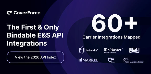
The copywriting underwent a significant change after I submitted the first few drafts. The feedback received was to make the logos more legible. After getting rid of the circle of logos and replacing it with 2 rows instead, there were issues with spacing which resulted in the logos looking cluttered. This was corrected in Ad Version 2E which was the version that was published.
Results
The first ad run performed 111% better than the previous ad campaign done by the previous agency, from 80 clicks to 169.
Ad Version 1 — Published in the Coverager Newletter


Ad Version 2 — Published in the Coverager Newletter and LinkedIn


Discover More...

New Wave - Concert Festival
Campaign Design, Brand Identity
Lawntopia - College Concert Event
Poster Design, Brand Identity
bottom of page