top of page
Design and the Play Instinct
A book for designers

Hero Image

Design and the Play Instinct5
Describe your image

New Design Book17
Hero Image
1/7
Design and the Play Instinct (concept)
Client
Paul Rand
Design Constraints
-Limited choice of fonts
-Black and white + 1 spot color of choice
-Given text and images only
Tools Used
InDesign, Photoshop
Contributions
Layout Design, Design Research, Art Direction
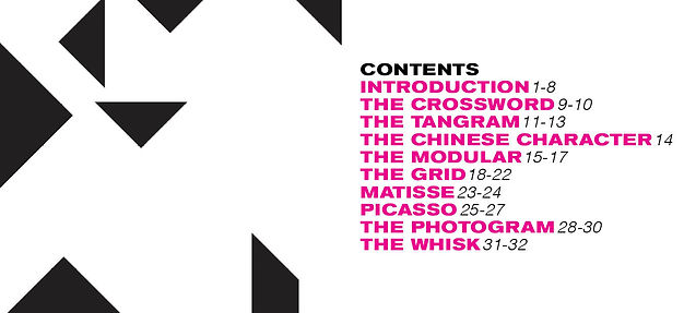
The core of the book was the idea of "Play" which I wanted to reflect in the spot color choice. The goal was something bright and attention-grabbing that would leave an impact. To balance the heaviness of the solid hot pink shapes, I mimicked the composition of the text or image on the opposite page of the spread.
I played with the negative and positive space using the layout of the content, typography, spacing, and graphic page numbers. I wanted an additional graphic element to create movement and engage readers which is why I then added page numbers that pop off the page. I emphasized balance through symmetry or lack thereof. Through consistency of type and layout, I ensured the pages individually looked like they belonged in the same book.
Process — Layout, Color, and Type
When exploring the provided type options, I found Akzidenz-Grotesk Bold Extended to be the most unique and full of personality. I decided to base the color scheme off of the sporty look of it.
The first thing that came to mind was the team colors of F1, specifically the iconic McLaren orange. The thrilling movement of the sport captured the qualities of "Play" I wanted to represent. However, in the end, I went with a hot pink because the feminine quality of it contrasted well with the masculinity of the bold and extended font.
Storyboarding the layout

Colors considered

Type exploration

Results
Select spreads


bottom of page